
Creating a Color-Drenched Bedroom: The Art of Layering Tones
- May 13, 2025
- 2 min read
There’s something undeniably captivating about a well-designed bedroom. It’s your sanctuary, your retreat, and the place where your personal style can truly shine. For our latest project, we decided to take a bold approach—color drenching. But this wasn’t just about splashing color everywhere. It was about creating a calming, visually balanced space that wrapped our clients in warmth.
Here’s how we did it. . . .
Understanding Color Drenching
Color drenching is all about embracing one dominant hue and layering variations of that color throughout the space. Think of it like stepping into a rich, immersive experience where your chosen shade takes center stage. But there’s a method to the magic, and it’s all about the 60-30-10 rule.
The 60-30-10 Color Theory
To ensure the room feels balanced and not overwhelming, we used the 10-30-60 approach:
60% Dominant Color: This is the main color of the space. We chose Secret Garden by Sherwin Williams and wrapped it around the room—on the walls, ceiling, and even the trim.
30% Secondary Tone: This space is a rental so we did not want to change the flooring or the builtins, which were marbled, white, and grey. Therefore, (off-) white became our secondary tone.
10% Accent Color: To add depth, we introduced two accent colors: black (building off of the black sliders and window frames) and small hints of gold.


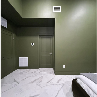
Photos taken after painitng was completed
Layering with Textures and Finishes
Color drenching is more than just paint. To create depth and dimension, we layered different textures and finishes:
Matte Walls: We selected a matte paint finish because it absorbs light and creates a soft, luxurious feel.
Lush Fabrics: We sourced variations of the dominant color from the custom upholstered bed frame to the two-tone rug and jumbo throw blanket. Then leaned into the secondary white tones, but adding light bedding, a cream bench, and linen curtains.
Accents: We selected black nightstands, art and picture frames. Then added subtle hints of gold with the nightstand hardware, lamp bases and flower bowls.


The Final Result
Stepping into this bedroom feels like entering a warm, inviting haven. The color drenching approach brought a sense of cohesion, but it’s the layering and accents that make it truly special. Our client's loved how it turned out — it’s proof that with the right balance, even a bold design choice can feel serene.

Ready to Transform Your Space?
If you’re ready to bring the magic of color drenching to your own home, let’s chat. Whether you’re dreaming of a rich, cozy retreat or a bright, energizing space, Woodson Interiors is here to help you create a room you’ll love to live in.


Comments